Best Screen Settings for Eyes: A Science-Backed Guide to Visual Comfort and Productivity

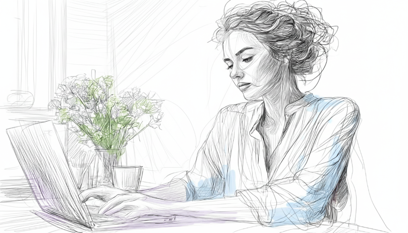
Emily, a talented video editor, often battled a familiar foe by mid-afternoon: screen glare. Hours spent finessing color grades and intricate timelines left her eyes gritty and her head aching.
She had tried everything – blue light glasses and even fancy ergonomic monitors – but the nagging discomfort persisted, dulling her creative spark and slowing her work. Like many of us who pour our energy into digital tasks, Emily discovered that the default settings on her laptop, while functional, weren't designed for her unique visual needs.
We live in a world tethered to screens, yet we often overlook the most immediate interface: our display settings. It's not just about aesthetics; it’s a critical conversation for anyone grappling with computer vision syndrome and seeking sustained focus. The truth is, there's no universal "best" setting. Optimal comfort is deeply personal, influenced by our biology, environment, and even the complexity of our tasks.
Personalized Screen Settings for Productivity
So, how do you move beyond defaults and craft a setup that supports your visual comfort and helps reduce eye strain? It starts with experimentation and an understanding of your unique sensitivities.
1. Brightness: Sync for the Best Screen Settings
Your screen's brightness should never fight your environment. Aim for a level that closely matches the ambient light in your room. If you’re in a brightly lit office, a brighter screen is appropriate. In a dimly lit studio, dial it down.
Why this matters: A stark contrast between a bright screen and a dim room forces your pupils to constantly adjust, which is a major cause of eye fatigue and headaches. Use auto-brightness as a starting point, but don't be afraid to take manual control to find the best screen settings for eyes.
2. Contrast: Clarity is King for Reducing Strain
Whether you use light or dark mode, sufficient contrast between text and background is crucial for readability. The goal isn't just less light; it's optimal differentiation without strain. Experiment with your system's contrast settings to ensure text edges are crisp and clear, optimizing your screen settings to reduce eye strain.
Read more about How Smart Screen Settings Can Help You Minimize Digital Eye Strain
3. Theme Mode: Light, Dark, or Contextual?
Your screen's Theme Mode (the overall color scheme of the operating system and applications) plays a significant role in perceived comfort.
-
Light Mode: Choose this for tasks requiring high visual acuity, like detailed text editing or proofreading, especially in well-lit environments. The high contrast can make reading effortless.
-
Dark Mode: Many find it reduces glare and eye strain, particularly in low-light conditions or during prolonged sessions (watching or editing videos). It can also reduce perceived mental demand for visual tasks (An Eye Tracking Study, 2021).
-
Context is Key: For visually intensive creative work, a calibrated dark mode could offer a gentler experience. For long document review during the day, light mode might be necessary. Listen to your body and adjust accordingly.
Get the full breakdown: Dark Mode vs. Light Mode: The Science-Backed Guide to Optimizing Your Digital Workspace
4. Color Temperature: Fine-Tuning Your View
Adjusting your screen’s color temperature can dramatically shape comfort. Settings like "Night Shift" or "Night Light" reduce blue light and shift colors to a warmer spectrum (more orange/yellow). This is particularly comfortable in the evenings, helping to support natural sleep hygiene.
The Underlying Science of Eye Strain
Beyond simply setting the color, understanding the biomechanics helps. For years, blue light has been the primary focus, but the full story is more nuanced. Research shows that factors like the quality of our tear film and our blink rate are significant contributors to visual discomfort. When we stare at screens, we tend to blink less, leading to dry, irritated eyes - a common symptom of computer vision syndrome. Adjusting the settings above helps create a calmer visual landscape, encouraging less strain.
Where To Find Your Best Monitor Settings For Eyes
Knowing what to change is only half the battle; knowing where to find it on your specific operating system is the key to immediate relief. Use this quick guide to locate the settings mentioned above on both Windows and macOS.
Feature
Windows Setting Location
macOS Setting Location
Brightness
Start Menu → Settings → System → Display
Apple Menu → System Settings → Displays
Dark/Light Mode
Start Menu → Settings → Personalization → Colors
Apple Menu → System Settings → Appearance
Night Light (Warmth/Color Temp)
Start Menu → Settings → System → Display → Night light settings
Apple Menu → System Settings → Displays → Night Shift
Text Size/Scaling
Start Menu → Settings → System → Display → Scale and layout
Apple Menu → System Settings → Displays → Resolution (or Accessibility → Display)
Contrast/Accessibility
Start Menu → Settings → Accessibility → Contrast themes (or Display)
Apple Menu → System Settings → Accessibility → Display
How to enable Night Shift on macOS or Night Light on Windows
How to check and adjust your Screen’s Contrast
Your 6-Step Screen Checklist
Here is your quick to-do list for maximum visual comfort:
-
Brightness: Screen’s brightness level is similar to the ambient light in your surroundings to prevent constant pupil adjustment and fatigue.
-
Glare Control: Position your monitor so light sources are to your side not in front of or behind you, to eliminate screen reflections.
-
Text Size: Use 12–14 pt font size and 1.4–1.6 line spacing to reduce visual effort while reading.
-
Text Smoothing: Enable ClearType (Windows) or font smoothing (macOS) for crisper text edges that are easier for the eyes to track.
-
Theme Mode: Use Dark Mode in dim light to reduce glare, or Light Mode in bright light for clarity.
-
Color Temperature (Blue Light): Activate "Night Shift" or "Night Light" in the evening to switch to warmer (yellow/orange) tones.
Empower Your Eyes, Elevate Your Work
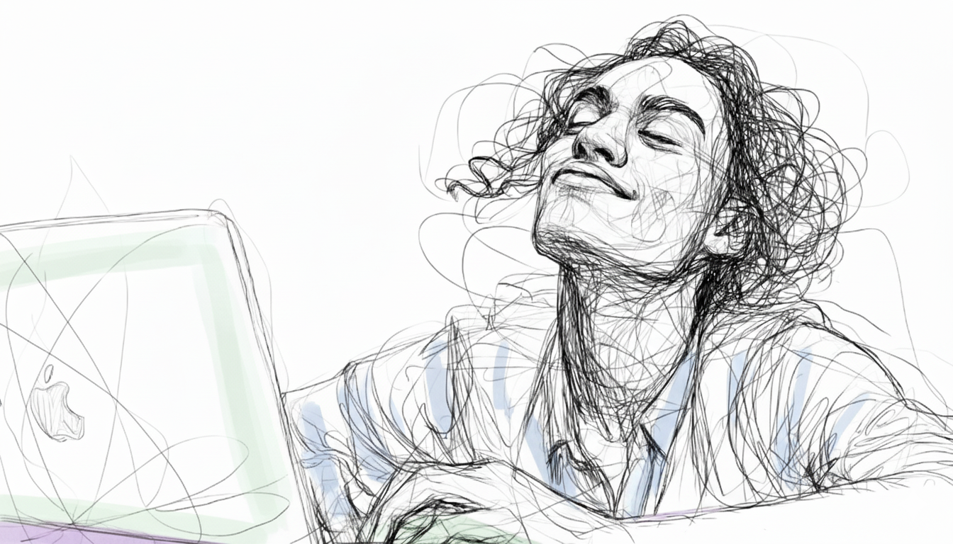
Your screen should serve you, not the other way around. When you tailor brightness, theme, contrast, and color temperature to your tasks and space, you unlock better productivity.
Just as Emily found her rhythm by tailoring her display, you too can transform your digital workspace into a haven of focused, comfortable work. Start small, test what feels better, and make your “comfort profile” the new default.
So what's the one setting you're going to change today to improve your visual comfort?
References & Further Reading
-
An Eye Tracking Study on the Effects of Dark and Light Themes on User Performance and Workload. (2021). Proceedings of the Human Factors and Ergonomics Society Annual Meeting, 65(1), 1629-1633. View Paper
-
Tosini, G., Ferguson, I., & López, R. (2016). Effects of blue light on the circadian system and eye physiology. Molecular Vision, 22, 61-72. View Paper
-
Gazit, T., Tager-Shafrir, T., Zhong, H.-X., Hung, P. C. K., & Cheung, V. (2025). The dark side of the interface: examining the influence of different background modes on cognitive performance. Ergonomics. View Paper